Digital centre brings new dawn of living data
 Days are numbered for the poorly timed still-frame slideshows that dominate business meetings worldwide, with researchers working on the next generation of data presentation.
The business leaders and decision makers of tomorrow will not be confronted with the same tedious and repetitive PowerPoint templates, fading effects and star-wipe transitions, thanks to a Deakin University research collaboration harnessing the power of data and visualisation technology.
Experts and academics have welcomed the launch of the SAS Visual Analytics Collaboratory.
“Five years ago, we had only just begun to hear about apps, we had never twittered, Google was just another search engine and graphs and charts were at heart just two dimensional,” Deakin vice-chancellor Professor Jane den Hollander said.
“Visual analytics not only has the potential to make complex data understandable to everyone, it makes it eminently interesting and engaging and absolutely relevant to individual business needs.
“It is an outstanding example of innovative and creative researchers working with our industry partners to create the jobs of the future and push the digital envelope to create something which benefits both parties as well as our students.”
SAS will provide a strong industry basis, as it has operated at the front of the pack for business analytics software and services.
SAS managing director David Bowie says the company is delighted to be able to collaborate with Deakin University in this innovative way.
“Without projects of this type and vision, there will not be enough skilled people to manage the exponential growth in Big Data that is now under way,” Bowie said.
The facility will work on exciting new ways to present complex data in a useful, analytical and appealing way.
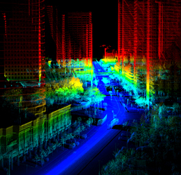
The 3-dimensional space offered by larger screens, projectors and sensors means people will soon be able to move around within their data.
Using gaming, motion capture and 3D visualisation technology, as well as the analytics software donated by SAS, researchers are experimenting with different digital environments to present and work with piles of information.
“People have so much data at their disposal nowadays which is more complex than can be captured easily on a spreadsheet and shown in graphs,” said lead researcher at the new centre, Associate Professor Jacob Cybulski from the University’s School of Information and Business Analytics.
“As you walk across or around the data, you can place markers, plot paths and construct tours, the locations of interest in the ‘data terrain’ which you would want to explore more fully.
“Ultimately we want to put people in the data, have them moving around and use motion tracking technology... Instead of using a mouse and keyboard, they will use their hand gestures to control what is happening in the data terrain.
“This approach is used in engineering and architecture, but not so much in the business world mainly because there hasn’t been a standard and uniform approach to representing the data.
“In 20 years’ time as gamers and people familiar with gaming technology become decision makers, their confidence will be with this technology rather than spreadsheets and pie charts,” he said.
The following video demonstrates a few of the cutting edge data interaction;


 Print
Print